Redesigning Outlook mobile web

Team
4 designers, 3 PMs & 15 engineers
DURATION
Dec 2019–Jan 2020
Company
Microsoft
About Outlook
Microsoft’s email service Outlook is available on native desktop, mobile, web and WatchOS. The mobile web offering had a consistent ~66 million user base when in 2019 the long-due redesign effort was picked up.
goal & Impact
Create the best-in-class email, calendar and contacts experience on the mobile web, while retaining our existing users. Monthly active usage grew to 70 million after release and we got largely positive user feedback.
My role
I was the 2nd designer to join the new team, responsible for the calendar tab, teaching experiences and collaborated with my team mates on several coherences exercises. Soon after the release I was leading design for the product.
Why redesign?
The mobile web experience was outdated in mobile interaction patterns, brand representation and wasn’t consistent with the other endpoints in features and styling.
Key screens: then
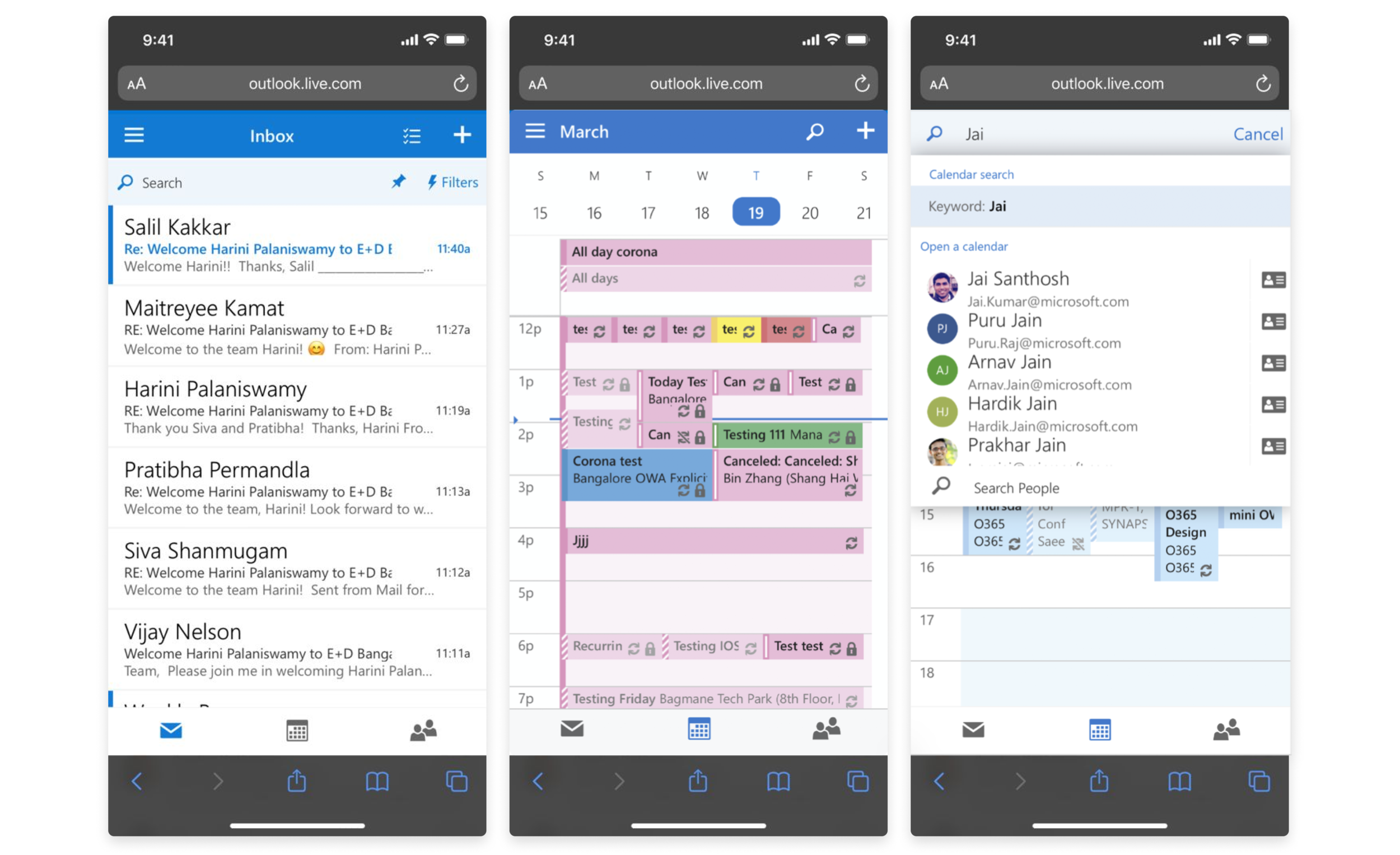
key screens: NOw

Here’s a video Oishee Sen and I created that was presented as part of Microsoft Ignite 2020 💙
Challenges & learnings
1/ Design language
At the time of the redesign, Outlook was slowly transitioning from the Fabric design language (top) to the Fluent (bottom). Mobile apps had started testing the waters with the latter but desktop web was a long way from the update. The challenge of which language to adopt was a tough one – how do we stay consistent with 2 different styles?
We took a data-informed decision. Since the overlap of our users was largely with desktop and desktop web and almost hardly with mobile apps, we decided to adopt Fabric and accommodate for a future Fluent update in our design system.

2/ Earned differences
We followed the desktop design language but our interaction patterns were mobile-friendly. We adopted interactions that were successful in the mobile apps, but established new patterns where we saw scope for improvement. For example, we did away with dropdowns as seen on other endpoints (top) and replaced them with thumb-friendly action sheets (bottom).
Our design and product decisions also differed from the mobile apps if it impacted performance, since there is a popular perception that web products should be faster and lighter than mobile apps. We ensured that users got to their tasks faster, whether with tech solutions or user experience decisions.

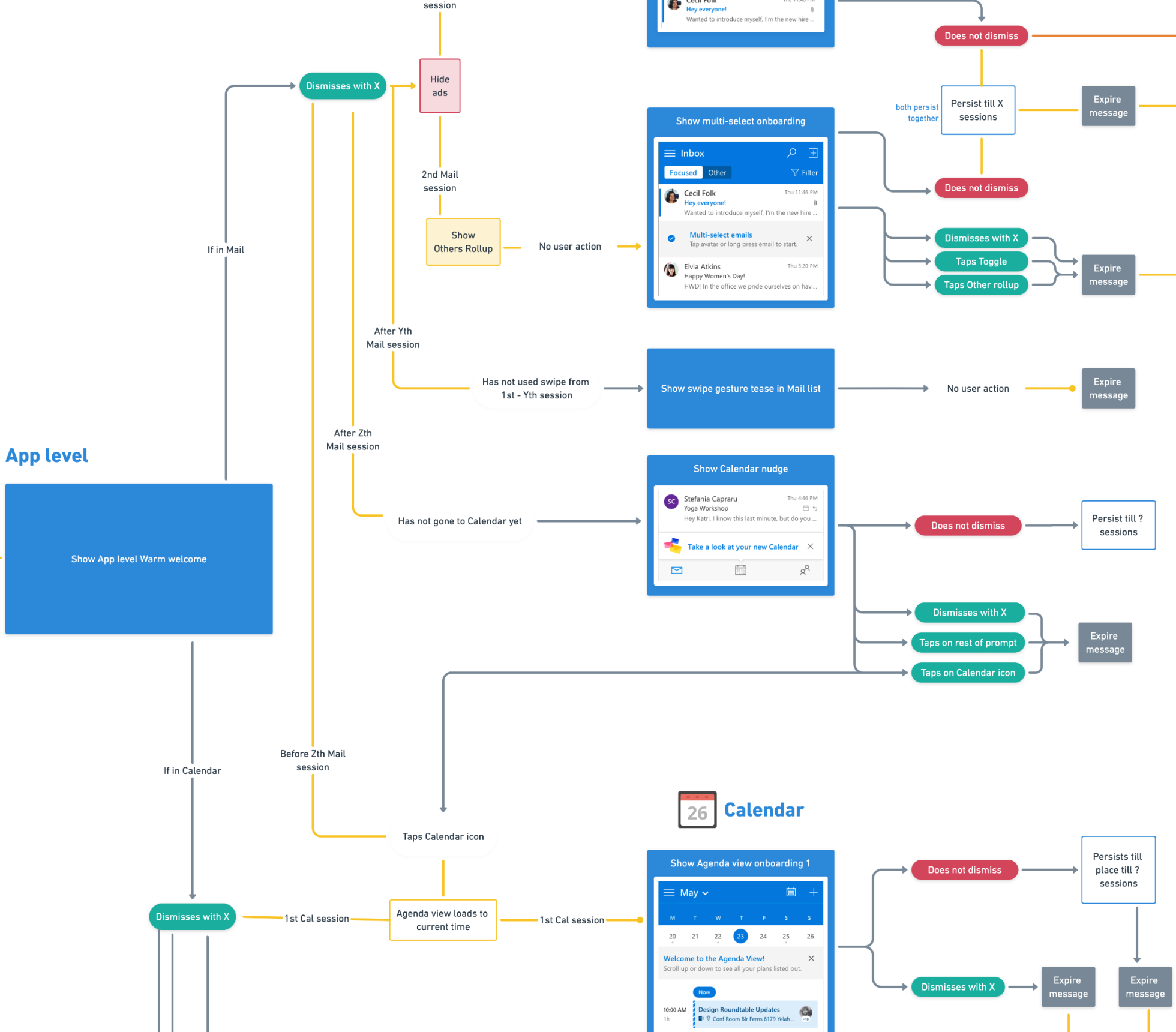
3/ Helping users navigate change
When products people use everyday to get work done change, it disrupts their tasks and creates a visceral aversion to and anxiety about the new changes. To avoid this initial negative reaction that may lead to losing our existing users, we studied data to see how people interact with the different surfaces and features. The common user journeys were used as signals to trigger the right teaching message.
I put together a framework to help the dev team build our campaigns. I also created the design guidelines, components and decision-making framework to help with feature discovery campaigns in the future. The guidelines ensure that messaging lights up only when it’s most useful to the user and avoids distracting them with irrelevant messages in the middle of their other tasks.
My article on designing for change gives more insight.
4/ Contribution to Microsoft’s design system
Soon after the release, our design and engineering team was able to help other product teams build and update their mobile web apps with reusable design and web components.
Our understanding of the challenges of designing for mobile web browsers, different screen resolutions and spotty internet connections came in handy when Oishee Sen and I worked closely with the Fluent team to create a Microsoft-wide design system for mobile web.

5/ Perceived performance
Outlook was commonly accessed on mobile web in regions with average or poor internet connectivity and/or on low-end devices. Hence performance and data sync were foundational to all features and experiences. Our engineers worked to ensure the app was light and fast, while my PM and I identified scenarios and envisioned ways to give users a sense of fast performance.
Our solutions included the use of motion, gradual load of content and well–timed, dynamic messaging to let users know they’re not stuck in a loop.
